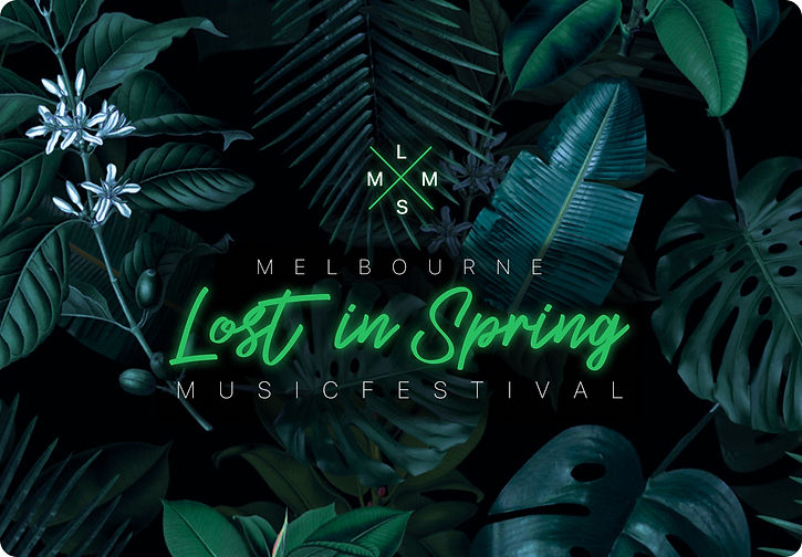
Lost In Spring
Lost in Spring - is my theme for Melbourne Music Festival. This APP is designed for music festivals, and the overall style is mainly green and black. The application is mainly used to purchase tickets and peripheral products.


01
Design Concept
The music festival held on a spring night is instantly reminiscent of The Wizard of Oz. Inspired by The Wizard of Oz, I hope people can enjoy the festival atmosphere as much as they are lost in spring. Based on this idea, the tone of green and black came into being.
02
Design Exploration
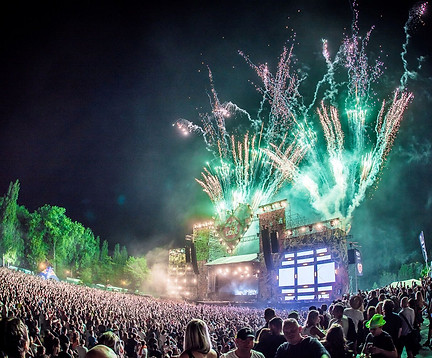
Moodboard

03
Branding Design
In the design of the logo, I use text as the main logo. Graphically, the feeling of being lost is highlighted by criss-crossing. In order to highlight the attributes of the music festival more, I did a fluorescent treatment on the color. On the poster, a jungle background was chosen as an aid.

04
Design Elements
Style Title
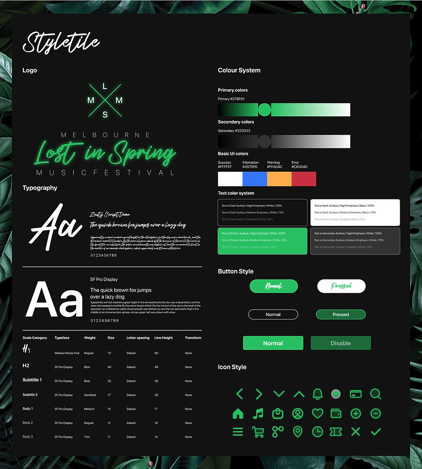
05
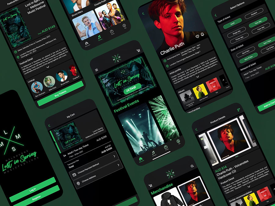
Interface
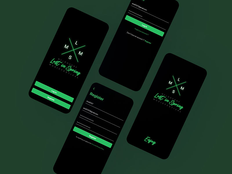
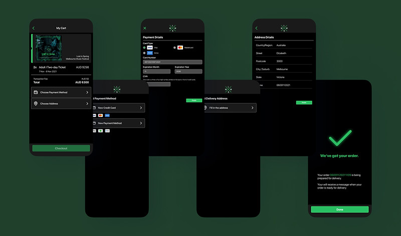
Buy Tickets
The process of buying tickets is mainly carried out after logging in and registering. In the details of ticket purchase, I simplified the ticket purchase process with options. This will be more convenient for users and avoid misoperation. The overall UI color also adds the effect of fluorescence, which can clearly understand the position of the operation.

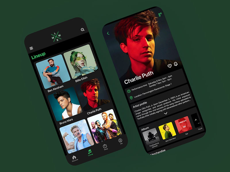
Line Up Information
Music festivals usually feature many singers or bands. This is in part so that users can see information about the singers or bands participating in the festival. Show off the entire cast with pictures and names as the main message. After entering the page, you can see the performance time and location. In addition, there are artist profiles and album presentations.
Buy Merchandise
This section shows the purchase process for music festival merchandise. You can see the music festival merchandise displayed on the shopping page. These items are related to the singers who participated in the music festival.

06